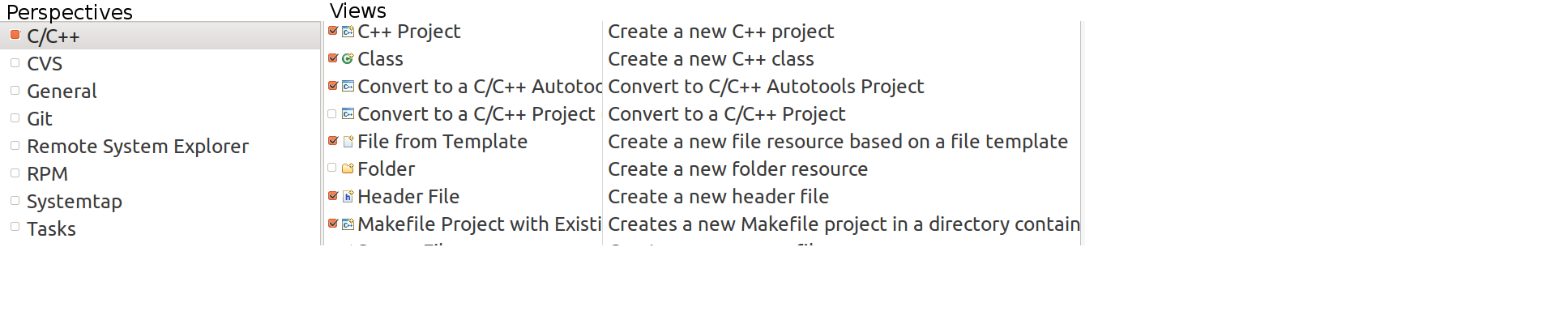
Currently perspectives and views are mixed in the view navigator. I would find it nicer if it would be organized as in the attached picture.
Currently perspectives and views are mixed in the view navigator. I would find it nicer if it would be organized as in the attached picture.
To Clarify:
Upon first seeing the view navigator perspectives and views can not be easily distinguished. While they are two different sections of the list, there is no strong visual cue to expect a double click on two entries in the respective trees to produce different results. (As would have been the case if there had been two list windows, or a big marker line between the two)
Additional comment:
An easy to use implementation would be:
Perspective 1 | View 1 [ ]
| View 2 [x]
| View 3 [ ]
Select a persective on the left an get a list of all views where the associated views are checked. Checking or unchecking views in the list would provide a quick way to edit it.
Hi there! 🙂
This task was auto-closed according to our Task Lifecycle Management.
Please follow this link for more information and don't forget that you are encouraged to reasonable re-open tasks to revive them. 🚑
Best wishes,
The MITK devs