Page MenuHomePhabricator

y-axis of blob plots always scaled to 5
Closed, ResolvedPublic

Assigned To
None
Authored By
aekavur
Feb 7 2022, 1:22 PM
Referenced Files
F2545919: image.png
Jun 14 2022, 11:56 AM
F2507780: T28966_test.R
Feb 28 2022, 1:08 PM
F2507781: csv_files.zip
Feb 28 2022, 1:08 PM
F2507733: data_matrix_single_task_30.pdf
Feb 28 2022, 10:42 AM
F2507737: data_matrix_single_task_19.pdf
Feb 28 2022, 10:42 AM
F2507734: data_matrix_5alg.pdf
Feb 28 2022, 10:42 AM
F2507735: data_matrix_3alg.pdf
Feb 28 2022, 10:42 AM
F2507736: data_matrix_single_task_27.pdf
Feb 28 2022, 10:42 AM

Description

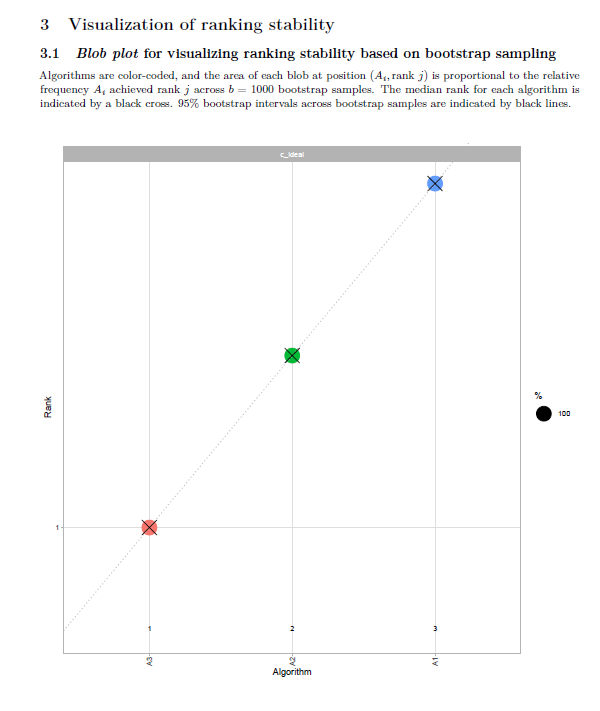
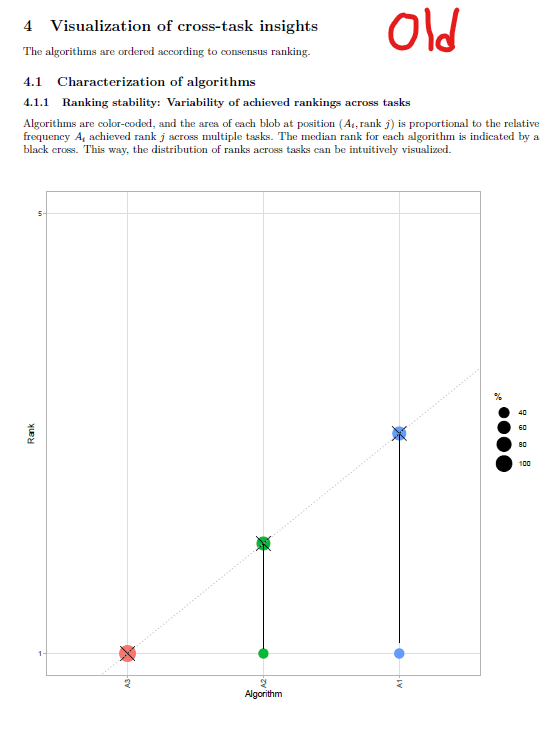
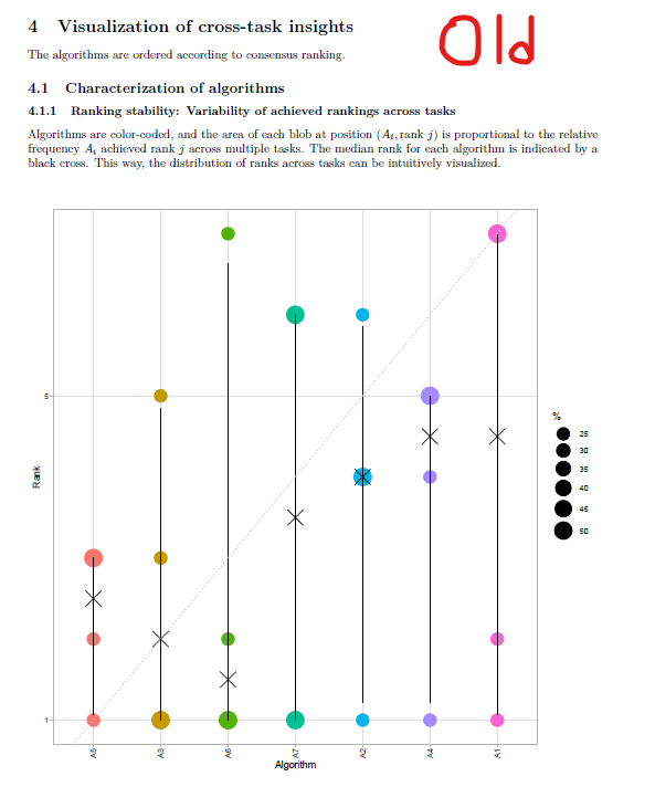
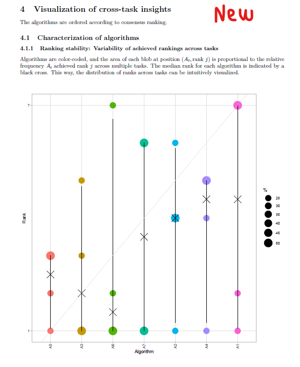
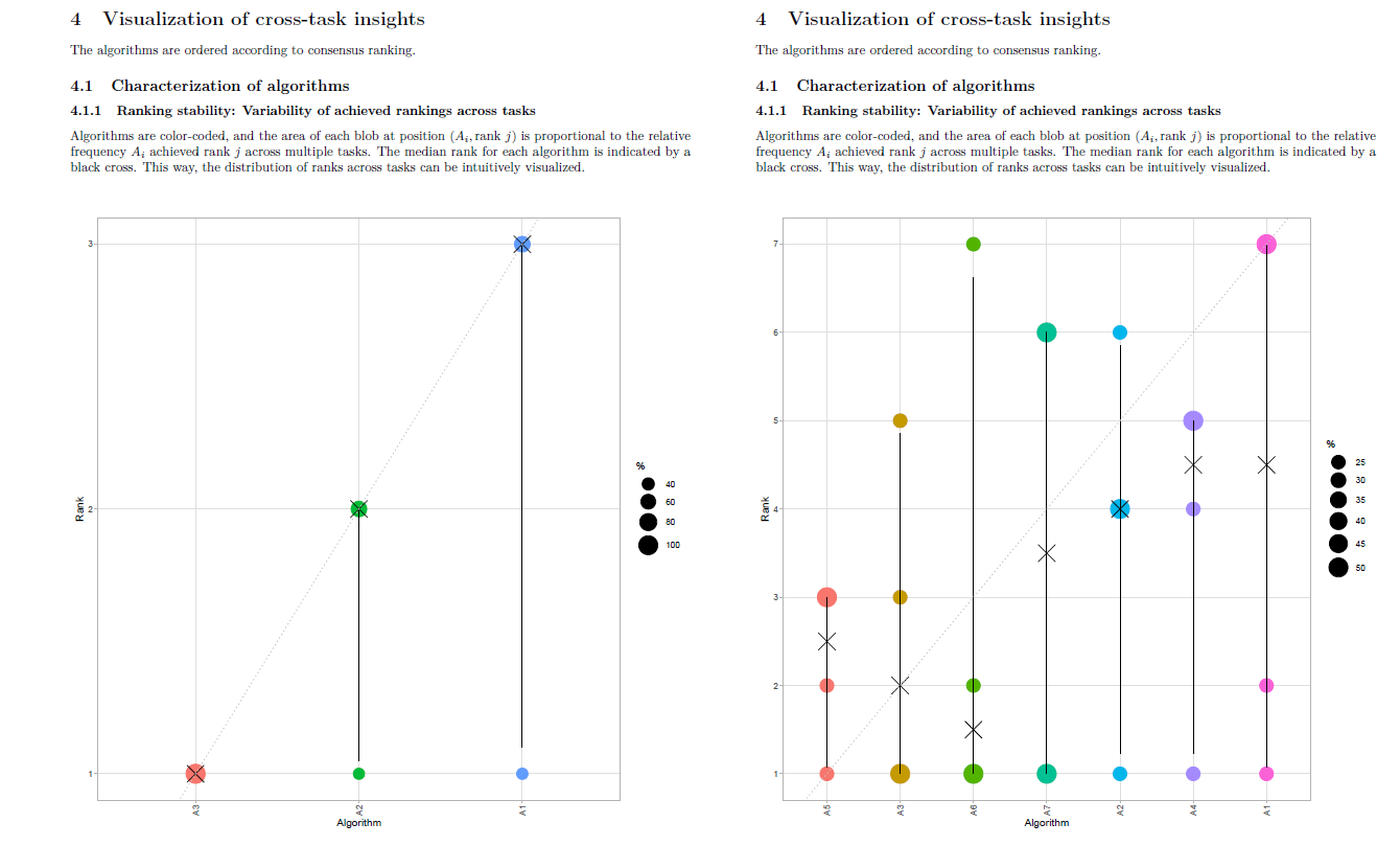
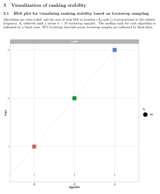
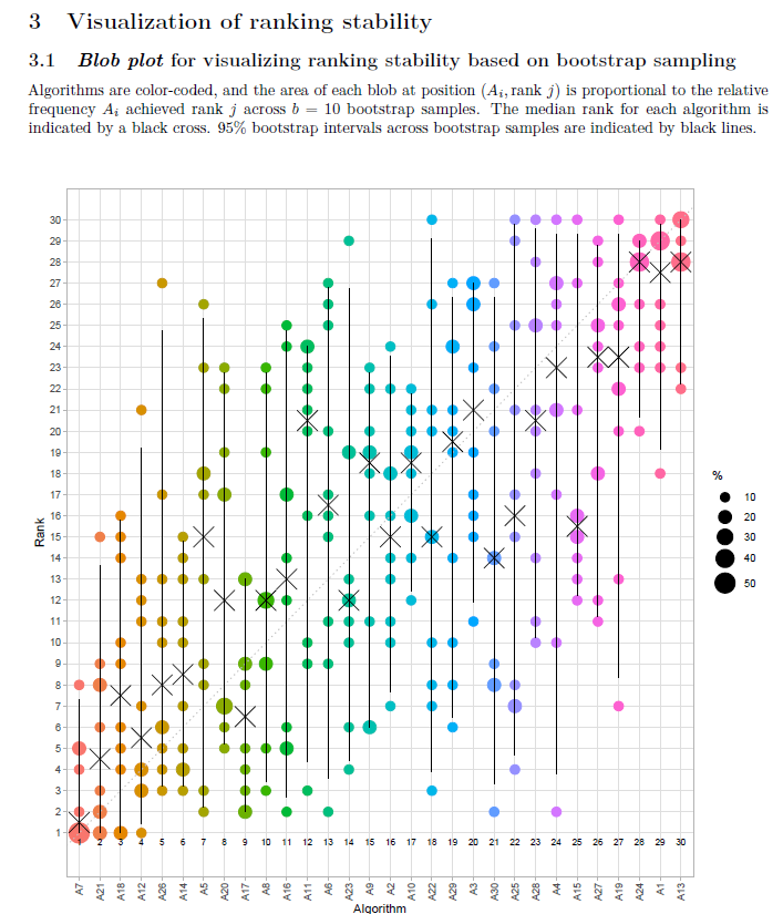
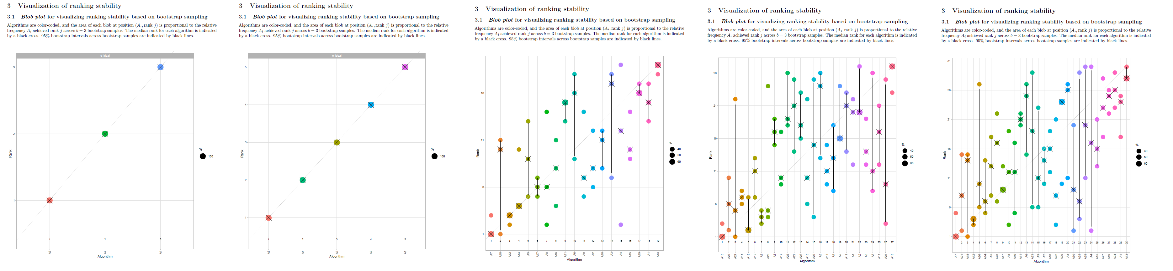
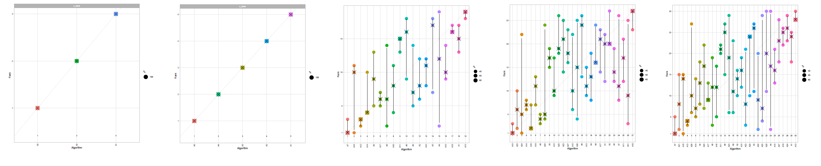
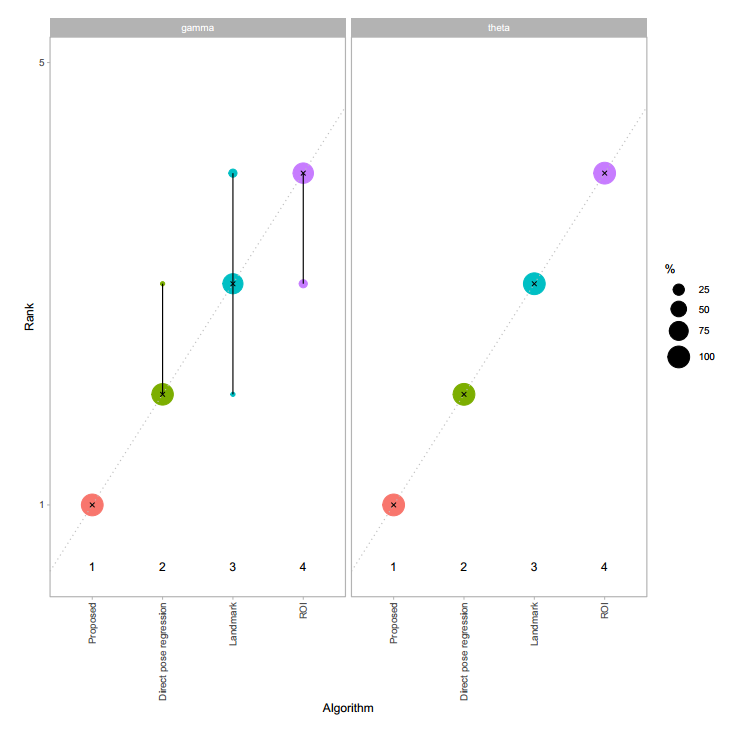
In the report, the y-axis of the blob plots (in sections 3.1, 4.1.1, 4.1.2, 4.2.1) are always scaled to [x 5] range, regardless of the number of algorithms in the data. If there are less than 5 algorithms in the data, this can create confusion, as shown in the image below:

image (1).png (730×736 px, 37 KB)

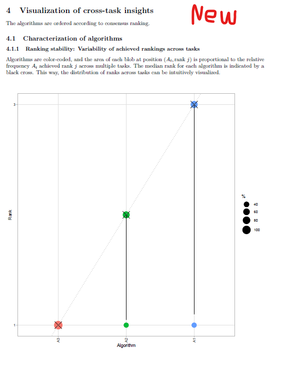
The solution can be scaling y-axis to [x #algorithms] range if number of algorithms <5.

Sample data and report are attached:

Event Timeline

aekavur triaged this task as Normal priority.Feb 7 2022, 1:22 PM
aekavur created this task.
aekavur updated the task description. (Show Details)

scale_y_continuous functions inside ./R/Stability.R file were modified. The problem seems solved. You can test it feature/T28966-YaxisOfBlobPlotsAlwaysScaledTo5 branch via the file at the attachment. (You can run it root folder of the challengeR code)

@wiesenfa @eisenman could you test it when you are available?

I have tested this with the provided data. The scaling of the y-axis seems to be correct now. But only the first rank is labeled on the y-axis. Can the other ranks be labeled as well?

blob_plot_missing_y-axis_labels.PNG (711×600 px, 37 KB)

Could you try to replace "breaks" by "labels" in

scale_y_continuous(minor_breaks=NULL,
                 limits = c(1, max(dd$rank)) ,
                 breaks = ifelse(max(dd$rank)>5,
                                 yes = c(1, seq(5, max(dd$rank), by=5)),
                                 no = 1:max(dd$rank)
                                 )
                 )+

or have both, i.e.

scale_y_continuous(minor_breaks=NULL,
                 limits = c(1, max(dd$rank)) ,
                 breaks = ifelse(max(dd$rank)>5,
                                 yes = c(1, seq(5, max(dd$rank), by=5)),
                                 no = 1:max(dd$rank)
                                 ),
                labels = ifelse(max(dd$rank)>5,
                                 yes = c(1, seq(5, max(dd$rank), by=5)),
                                 no = 1:max(dd$rank)
                                 )
                 )+

?

Another option would be to leave them undefined and leave it to ggplot2 to automatically choose, this can however lead to labels e.g. at 1,3,6,9,11. On the other hand, in the current implementation in case of 9 algorithms we only get labels at 1 and 5 which may also be suboptimal.

Matter of taste probably, would be good to test with both small and large numbers of algorithms and even and odd number of algorithms.

I have tried suggested codes but they did not fix the problem. Besides, there caused additional issues. :)

Now I suggest a general solution regardless of number of algorithms. The y-axis is scaled to number of algorithms, that is all :) . I think simple is the best approach here. I have updated relevant fields with:

scale_y_continuous(minor_breaks=NULL,
                       limits=c(1, max(dd$rank)),
                       breaks=seq(1, max(dd$rank), by=(max(dd$rank)-1)))+

I am sharing the results of this modification:

blob_3alg_old.png (737×555 px, 44 KB)
blob_3alg_new.png (730×568 px, 45 KB)
Old version with 3 AlgorithmsNew version with 3 Algorithms
blob_7alg_old.png (712×593 px, 52 KB)
blob_7alg_new.png (716×586 px, 52 KB)
Old version with 7 AlgorithmsNew version with 7 Algorithms

I have updated code in the related branch.

not sure whether this is a good idea. imagine a challenge with 18 algorithms. there will be only a 1 and an 18 and nothing in between, this may make it difficult to read. what do you think?

I agree with you. On the other hand, putting breaks according to a defined integer can be tricky. For example, let's assume that we have decided to define breaks on every 5th element. The y-axis will be a 1,5,10,15,18 for a challenge with 18 algorithms. The last portion of the sequence will have a different period. Therefore, I offer including all integer breaks for the [1, #algorithms] range. I am putting some examples here:

image.png (809×1 px, 79 KB)

This will be a simple solution that works regardless of the algorithm amount. What do you think?

If I remember correctly this didn't work layout-wise for large number of algorithms. Numbers will either overlap or need to get very small/size of figure will need to be increased.
try to test with something like 20 algorithms, how does the report look then?
what's the problem with 1,5,10,15,18? the scale isn't affected, so for me it wouldn't matter that it's not the same intervals. in principle you could also omit the 18, i.e. only 1,5,10,15. Instead of all integers, I would rather use the automatic choice.

Let's try the automatic config of ggplot :)

I only used scale_y_continuous(minor_breaks=NULL) configuration to prevent floating-point numbers on y-axis. The remaining job is handled by ggplot2. These are the results:

3alg_auto.png (660×543 px, 38 KB)
7alg_auto.png (671×565 px, 41 KB)
30alg_auto.png (657×542 px, 88 KB)

For comparison, I am also putting the version with all integers on y-axis:

30alg_1.png (825×707 px, 129 KB)

I guess overall it's a matter of taste.
Fully automatic one has several problems: in case of the 30 algorithms, scale starts with 0 which is not sensible. I'm not sure what happens with something like 27 or 17 algorithms (a number which doesn't divide by 5). in case of the 7 alogirhtms it starts with 2 which I find a bit weird, I would expect a scale starting with 1. Thus, I would at least include the limits=c(1,max(...)) argument which however as said before may lead to sequences like 1,7,13,... but maybe this is not so much of a problem.

Maybe the more complex strategy of sizing the figures we introduced some time ago allows to provide all integers, I'm not sure.... @eisenman what do you think?

I have tried many configurations just to force ggplot2 to start y-axis labels from "1" when choosing automatic scaling. However, it was not possible :/

The second solution that I tried is defining 5 algorithms as a threshold, as we discussed at the beginning. If number of algorithms 5 or less, there are all integer values on y-axis. Otherwise, there are labels on each 5th element. I have tried hundreds of different configurations based on this code:

scale_y_continuous(minor_breaks=NULL,
                 limits = c(1, max(dd$rank)) ,
                 breaks = ifelse(max(dd$rank)>5,
                                 yes = c(1, seq(5, max(dd$rank), by=5)),
                                 no = 1:max(dd$rank)
                                 ),
                labels = ifelse(max(dd$rank)>5,
                                 yes = c(1, seq(5, max(dd$rank), by=5)),
                                 no = 1:max(dd$rank)
                                 )
                 )+

However, ggplot2 does not produce the results as we wanted for some reason that I do not know. After spending too much time, I changed strategy. I have used scales library and could produce very similar what we want:

scale_y_continuous(minor_breaks=NULL,
                       breaks = ifelse(max( dd$rank)>5,
                                       yes = scales::breaks_width(5, 1),
                                       no = scales::breaks_width(1, 1)
                       ),
                       limits=c(1, max(dd$rank)),
    )+

This worked better than any other solution. The only difference is the sequence is not [1, 5, 10, ...]. It is [1, 6, 11, ...].(I could not find a way to reproduce [1, 5, 10, ...] with scales library unfortunately) Here you may see the results for 3, 5, 19, 27, 30 algorithms:

challengeR_blob.png (866×3 px, 286 KB)

What do you all think about this config?o

THanks Emre! This sounds like a lot of effort. Please give me some time to have a look at it

I think the solution is to consider rank not as continuous but a factor (essentially a string)
That means first following

rankDist=rankDist%>%mutate(algorithm=factor(.data$algorithm,
                                               levels=ordering))

is extended by

rankDist=rankDist%>%mutate(algorithm=factor(.data$algorithm,
                                            levels=ordering),
                           rank=ordered(.data$rank))

and then

scale_y_continuous(minor_breaks=NULL,
                   limits=c(1,max(5,max(rankDist$rank))),
                   breaks=c(1,seq(5,max(5,max(rankDist$rank)),by=5)))+

is replaced by

scale_y_discrete(minor_breaks=NULL,
               breaks = switch(2 - (max(as.numeric(dd$rank))>5),
                              c("1",  as.character(seq(5, as.numeric(max(dd$rank)), by=5))),
                               as.character(1:max(dd$rank))
              ),
                 expand=expansion(mult=.03)
)+

The "expand" argument removes some of the space before and after rank 1 and maximum rank, respectively. Might improve appearance additionally.

The following code shows a demo that it should work:

library(scales)
library(ggplot2)
n.algorithms=17
dd=data.frame(rank=ordered(1: n.algorithms))
demo_discrete(dd$rank,
              breaks = switch(2-(max(as.numeric(dd$rank))>5),
                              c("1", as.character(seq(5, as.numeric(max(dd$rank)), by=5))),
                               as.character(1:max(dd$rank))
              ),
              expand=expansion(mult=.03)
)

Would it be possible for you please try it please? Sorry, I have no test routine implemented and a bit stressed at the moment... please let me know if this is too much hassle for you and I'll do it some time.

I have tried this approach. I just needed to remove minor_breaks=NULL, line since there is no such a config in R/scale-discrete-.r

The problem seems almost solved, but there are new problems:

  1. Blob plots changed. There were solid lines between the same colored disks on the same column. Now there are disappeared.
  2. The modifications did not affect the plots under "4.1 Characterization of algorithms" section.

I am sending the generated reports for different algorithm numbers.


thanks Emre. that's problematic, confidence intervals are missing. Could you share a code file for testing with artificial data (ideally not with the report as output but the plot itself)? Then I will try to look into it. or is this difficult for you?

I am sharing my current test code with artificial data. Since there can be 4-5 blob plots in the report (depending on data, task number), I need to prepare a new test code for only blob plots. Until that, you may use the code I am sharing.

Hey everyone,

Since we are very close to deploy web interface, I am planning to create a new minor release or challengeR this week. In order to proceed, we need to decide and conclude our strategy for the y-axis of blob plots. What are your final opinions? Which solution should we select?

I like the results when the scales library is used! However, when we find a way to bring back the confidence intervals, also @wiesenfa's latest solution can be used.

Hey everyone,

I discovered something tricky. When I first tried this, it didn't work, as you remember:

Could you try to replace "breaks" by "labels" in

scale_y_continuous(minor_breaks=NULL,
                 limits = c(1, max(dd$rank)) ,
                 breaks = ifelse(max(dd$rank)>5,
                                 yes = c(1, seq(5, max(dd$rank), by=5)),
                                 no = 1:max(dd$rank)
                                 )
                 )+

I found the reason. It is caused by ifelse. It seems ifelseonly returns the first element of the array. In other words, breaks = 1 when max(dd$rank)>5, instead of breaks = 1, 5, 10, ... The reason is that ifelse returns a value with the same shape as input according to docs. Since max(dd$rank)>5 is an integer, ifelse returns only the first value of the array here.

Finally, I used if..else.. block instead of ifelse. I modified the code as below:

# Define breaks before creating plot
if (max(rankDist$rank)>5) {
    breaks = c(1, seq(5, max(rankDist$rank), by=5))
} else {
    breaks = seq(1, max(rankDist$rank))
}

# Create plot      
ggplot(rankDist)+
geom_count(...
scale_y_continuous(minor_breaks=NULL,
                           limits=c(.4, max(rankDist$rank)),
                           breaks=breaks)+
...
...

The results are very similar with the scales library, but we can have total control over the sequence. I am showing the results for different number of algorithms:

image.png (580×2 px, 144 KB)

We are planning to close this issue and publish a minor release as soon as possible (in this week preferably) so what are your opinions?

Cheers ;)